About Me

My photo
Liverpool, United Kingdom
I'm a student just trying to get by and promote my illustrative work. I'm interested in graphic novels, cartoons and concept art, always looking for criticism and more work to gander at! If you'd like to contact me my email address is Coldcoldethyl@googlemail.com

Friday 27 January 2012

Lack of updates


Sorry for lack of updates, i've been doing a private project which i'm not sure if I can post images up on here.


here is a picture of one of the ravens I introduced in the last page of my comic. According to legend Hel made Odin's Ravens.  In my story I want the ravens to have returned home and possibly bred? I'm playing with the idea but I love ravens. I realise that they are over used in literature but they are so beautiful and intellegent creatures.  I will be adding a background to this imageand will post the results in due time.


Here is some concept work. With teh first image I was trying to get a dusty painterly effect and in the second image I was a bit Jamie Hewlett inspired. I really like how my first image turned out, but the second is A) too cartoony B) too scary.

I on't usually work in black and white so this was a challege for me but I think it is important that I work on this problem.

Recently i've been reading through 'Making Comics' by Scott Mcloud. It's completely fascinating and i'm learning about small nuances in the comic book world I previously didn't know about. It was originally recommended to me by Earthworm Jim creator Doug Tennapel and then by my friend Dave who is also a comic buff. Hopefully my work will benefit from this book.

Wednesday 14 December 2011

Life Drawing week 4

I haven't scanned in my last lot of life drawings but will do at a later point, this is this weeks which I did completely digitally as an experiment!


New Page!


new page! I tried a different system to the last page, I decided to draw out the page traditionally then scan it in and colour it digitally. I normally draw each panel then put them together on photoshop. I think this looks more dynamic and the layout more interesting. I will be adding text to it to finish it off. I read up that Norse trolls when hit by sunlight turn to stone, this is this dude here.


 haven't updated for 2 weeks but have more art to post, will be posting 2 weeks of life drawing up tonight as well as a couple of sketches.

Wednesday 30 November 2011

Life drawing, 2 weeks worth!


Week 2


I wanted to play with colour and get my work looking a bit more loose this week, there is obviously stuff i'm less than happy with and stuff i'm really proud of. I like how the water mixes with the black ink ad I like some of the tones and shadows I get with the water colours

Week 3


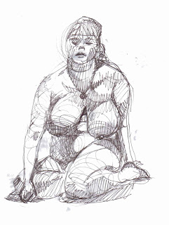
Different more curvy model. I had a lot of fun drawing her and she has a completely different body shape to the other model, her shape is closer to the shape i'd like my character to be so it was great practice! I used felt tips mixed with water this time and love the effect I got on some. This week I realised I need to practice more of faces however.

Update at long last!

Sorry for the lack of posts recently, will have some nice new posts over teh course of today!

I'm currently reworking how my writing is being done as well as my new logo for the website. I've been playing with various fonts from different sites and have ended up picking this as my Logo:

at least for now anyway. I wanted to captyre the norse feeling as well as the coldness of the environment. I realise that in the long run the icy border may not work but i'm currently learing illustrator and hope to have a more multi background friendly version soon. I also went for teh mask idea as it looks interesting and captures the character of hell fairly well and simply.


while at thought bubble I asked the good folks at self made hero to critique my portfolio, one of the pictures Rob Davis critiqued in particular was this one. I liekd this image originally but he pointed out the lack of contrast as well as the lack of depth in the image.


This is my attempt at fixing this, I want to keep the neony effect within the image but also keep it dark and make the lights actually look like they are lighting things up. I feel that this change has actually helped the overall look of page 2 as it matches my other images.

I also decided to scrap this image:


As I felt it was too bright and the blue set a different tone to the other images, as well I didn't want the characters face to be constantly focused on. I did like her body language though and decided to focus on her feet. This character wouldn't just decided to walk la-de-da into a cave, she'd be nervous about it and her feet would show this the most adequately.


Again this didn't work, but I played around with the contrast again as well as effects and then placed it in the overall image, this is how it's turned out:


I think this captures the atmosphere I'd envisioned with this page, stood at a precipice and the contrast if warmth and cold. I will be adding words next.

my next update will have this weeks and last weeks life drawing work.

Tuesday 22 November 2011

Zappa

I saw Zappa plays Zappa a Frank Zappa tribute band last night and did my own tribute sketch, so here it is to make up for the wordy last post:


i'm going to life drawing tonight so some more life drawing will be posted tomorrow too!

Thought bubble summarised!

Right, this is a wordy none picturey post but I just want to sum up the weekends events for future knowledge and reference both for myself, and for if I ever get any kind of following on this blog as it may be helpful!

to start with here are my notes from 'reading between the lines' and from when I spoke to one of the people presenting it the next day and got some extra help ( Ian Sharman at Orang Utan Comics- who also signed a nice shiny copy of hero 9 to 5 which he wrote and lettered!)

The talk was a Nice varied one, which went into synaesthetics (emotional marketing) and how the layout of speech bubbles within the comic can influence the audience, for example if it runs left to right smoothly and brings the readers eyes around the page in a nice smooth line the reader will be at ease, but if the bubbles seem mish-mashed  and there isn't an obvious order the reader can become agitated and it's a sign of dysfunction within the story. This is something I hadn't considered while making my comic and is extremely interesting!

we were also given links to various lettering websites: Blambot, clintflickerlettering, kleinletters, balloon tales which are all extremely informative and I have no idea how I haven't come across them in google previously!

On the Sunday I went and spoke to Ian Sherman, told him how much I enjoyed the presentation and he gave me some more valuable info, general hints and tips like when drawing speech bubbles, you should round very slightly square them off as just general ovals looks silly, which I agree with but hadn't noticed that the good ones were squared which is very useful! I was also told that the 5 'must-look at' letterers are:

John Workman
Todd Klein
Tom Orzechosky
Dave Simm
Tom Frame
well I hope this information helps someone besides myself in the future! It's just handy to have a small summarised blog post on this stuff, although I have a feeling that like any art it would take a lifetime to master!


------------------------


well, since I called this post thought bubble summarised I better get into some of the fantastic artists I met and some of the wonderful comics I now own!


One of the nice surprises I got was coming across a lovely Canadian lady (Kaylea Hillier) who wrote the comic galavant which I now own in lovely shiny published form. I read this on the way home and it made me laugh and feel sad and get some nostalgia as I've been to several of the places she describes (also felt a bit excited when I saw a Liverpool mention, oh dear...) but I spoke to her at the time being one of the first girl comic book authors there which made me very happy, there were several more I noticed afterwards but Kayla was so lovely to me! People should buy her comic, it's very nice and a nice change from explosions and blood etc!

I also got recommended Laydeezdocomics by a lovely gentleman called Aneurin Wright who's book 'Never eat with a spoon that which can be eaten with a fork' made me laugh out loud on the coach home, it's rules of etiquette juxtaposed with portraits of people banned from the local mall. I went on a tangent then, but I am very interested in Laydeez do comics and have started to watch their excellent  blog, and encourage others to do so too!

I will keep linking comics in other posts but the last one I'm linking today is Hellbound media who don't have their website up as of yet so I linked their facebook page instead! I bought a comic called shock value who's cover is amazing and beautiful! I'm keeping an eye on this company for more lovely horrible things to come!

I came across a table owned by Dot Comics which is again a facebook link, these guys have the goal of bringing webcomics into print and they had a lovely compilation book at the stall which i was too poor to buy I regret, I will own it next time or when I can find an online store for it :( these guys were lovely and very nice, I came away with a nice newspaper they printed though!

there's my 'basic' summary anyway, hope it's been helpful!